Three Months with Microsoft's Office 365
by Vivek Gowri on January 31, 2013 11:59 PM EST- Posted in
- Microsoft
- Cloud Computing
- Office 2013
- SkyDrive
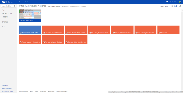
How big is Microsoft pushing the cloud integration in Office 2013? After signing into a Microsoft account, SkyDrive is the default save location in all Office apps, replacing the local My Documents folder. That’s an important distinction, because SkyDrive is a huge part of the Office 365 message (and likewise, Office integration is a huge part of SkyDrive’s appeal).
Combined with Office Web Apps in SkyDrive, the Office+SkyDrive combination is actually a pretty powerful way of creating and editing documents and presentations from the web, much more so than Google Docs is. And in that, I think Office 365 makes some huge strides in matching the convenience factor of Google’s purely online document creation tools, except with all the versatility and formatting power that comes with proper Office.
Sharing files from SkyDrive is also a breeze, much like Dropbox. And honestly, between the cheaper storage upgrades and Office integration, SkyDrive looks like a pretty compelling option for cloud storage when compared to Dropbox. Microsoft is doing a good job of leveraging its own products and services for better online integration, and that’s really one of the main stories in the new Office.
I’m coming away from Office 365 a big fan of the Office 2013 suite, along with a newfound appreciation of SkyDrive. The combination is a potent one, and could make the lives of students and professionals much, much easier. Unlike many Microsoft software redesigns of years past, including Windows 8, I don’t have too much in the way of misgivings about this one. The improvements are pretty comprehensive, and offer a more streamlined, polished, and visually refined user experience. That’s about all you can ask from an office suite.
My real questions center primarily around the subscription model. And even that is mostly limited to single or dual user families that don’t have access to a University subscription or Microsoft’s historically lenient home use agreements for commercial licenses. The $99 yearly price for Office 365 is pretty steep if you don’t make use of either the multi-computer install capabilities or the cloud services. I’d say in that case, you’re probably better off just getting a standalone Office 2013 license and signing up for a SkyDrive account which comes with 7GB of free storage. If you really need more storage, the 20GB upgrade only costs $10 per year, which isn’t bad at all. Or, alternatively, you could pay a student to get you an Office 365 University serial number on the cheap. [Update: I was joking about this part, sorry if it didn't come across that way. Yes, it violates the EULA, so no, don't do this.]
Other than that? It’s great. If you’ve got 4 or 5 computers to install Office on, $99/year isn’t bad at all, and for students that can get the University license, $79 for 4 years is a bargain considering that it comes with 20GB of SkyDrive storage for that four year stretch of time. If you have Office 2010 and are happy with it, I wouldn’t say you need to upgrade though the cloud integration makes that a compelling option, but for users of any previous edition Office, I’d seriously recommend making the transition.


113 Comments
View All Comments
mevans336 - Friday, February 1, 2013 - link
What is it in?VivekGowri - Friday, February 1, 2013 - link
Mechanical Engineering. Already graduated actually, diploma is in the mail :)mevans336 - Friday, February 1, 2013 - link
Awesome, congratulations! What school?Samus - Saturday, February 2, 2013 - link
All my buddies (and myself) have ME degrees (I don't have a masters) and they have vast flexibility with employment. I've had jobs ranging from Ford to IT consulting. I did go back to school for an associates in EE, but its funny that none of us any longer have a typical ME job. One of us is a truck driver, lol!p05esto - Friday, February 1, 2013 - link
I really dislike the UI and graphical style of this and Win8. It's 2013 and the interface so totally boring, no color, no shading, no shadows, doesn't pop or anything. Why 1 color icons, can't we make things look nicer than this? Maybe it's a small thing, but it all looks cheap and uninspired, so cold and boring. No thanks to the Modern UI.B3an - Friday, February 1, 2013 - link
Yeah exactly, it's 2013. Not 2005.If you like dated graphic design, things like gradients, shadows, shiny icons, gloss, material emulation and pointless rounded corners then either go back to 2005 of use iOS or OSX.
Speaking as a designer i can safely say that pretty much all modern design is heading this way. Including site designs. Whenever you see a new design of a major site it's nearly always more Metro-ish looking. Thats because it's better, it's cleaner, it's more efficient, it focuses more on content not pointless chrome, it cuts out then needless crap and most people prefer it.
Wall Street - Friday, February 1, 2013 - link
But the UI is horrible. IT doesn't indicate what is clickable or not and has a poor use of white space. The best interfaces have a good user experience and build the aesthetic around that. Metro clearly had the aesthetic laid out before they made the interface.Murloc - Friday, February 1, 2013 - link
apart for the removal of gradients and juicy looking 3D icons, it's very similar to 2010.In 2010 you can see what is not clickable because it's greyed out. I guess it's the same in 2013.
The icon style changed but other than that there's really no difference in looks.
Murloc - Friday, February 1, 2013 - link
look at the copy button in the first image of the look and feel page: it's greyed out.Flunk - Friday, February 1, 2013 - link
Actually, it's very easy to tell what's clickable. Everything that's not the background color is clickable.Actually the Windows 8 UI uses far more color than the old interface did and it uses them for informative purposes, not just graphical bling. It's content over all else and functionally it's much better than the old 1990's style of psudo 3D everywhere which basically only tells you what you can and cannot click.